Amazon Quick Sight, the business intelligence capability of Amazon Quick, delivers a unified BI experience, from modern interactive dashboards and natural language querying to pixel-perfect reports, machine learning insights, and embedded analytics at scale. Amazon Quick brings together AI-powered agents for business insights, research, and automation in one integrated experience, helping teams work smarter and faster while maintaining security and access policies.
Today, we’re excited to announce two new capabilities that make Quick Sight dashboards even more expressive and business-aligned: sparklines and custom sort for controls.
Tables are the most widely used visual type in Quick Sight, and with these additions, they become part of a significantly more powerful authoring experience. Sparklines embed compact, inline trend charts directly inside table cells. Instead of navigating to a separate line chart to determine whether a metric is improving or declining, readers can spot the pattern right where the data lives, in the table itself. Custom Sort for controls gives authors the ability to define a precise, business-driven order for drop-downs, and list controls. A status drop-down can now read Escalated, In Progress, Resolved, and a segment list can present Enterprise, Mid-Market, SMB, sequences that reflect how your organization prioritizes work, not how a database returns results.
In this post, we walk through both features, what they are, when to use them, and how to configure them, with real-world scenarios that bring them together in a practical, decision-ready dashboard.
By the end of this post, readers will be able to:
- Understand what sparklines and custom sort are and the business problems they solve.
- Enable and configure sparklines within a table.
- Define a custom sort order for dimension fields in Quick Sight.
- Apply both features together in a real-world dashboard scenario.
- Understand key considerations for using sparkline and custom sort.
Prerequisites
Before following the steps in this post, verify you have:
- An active AWS account with permissions to access Amazon Quick.
- Amazon Quick Enterprise edition enabled in your account.
- Author or Author Pro access to create and manage analyses and dashboards.
- Basic familiarity with Quick Sight concepts: datasets, analyses, field wells, and dashboards.
Getting started with sparklines
Sparklines are compact inline line charts that are embedded directly within table cells. Rather than requiring a separate visual to show trend data, sparklines allow readers to see and compare trends immediately without leaving the context of the surrounding data. They present the general shape of a trend without axes or coordinates, typically over time, in a simple and highly condensed way.
Complete the following steps to add sparklines to table visual:
- Log in to Amazon Quick and open the analysis containing the table visual you want to enhance.
- Choose the table visual to activate it. Verify the visual has at least one field in the Group by field well and one numeric measure in the Values field well.
- On the menu in the upper-right corner of the visual, select the Format visual icon (pencil visual). The Format visual pane opens on the right side.
- In the Properties pane, open the Visuals drop-down list and choose APPLY SPARKLINES. The sparkline editing pane opens.
Configure and customize the sparkline settings:
- For Value column, choose the measure field that you want the sparkline to represent (for example, Revenue, Ticket Count, or Health Score). Note that fields already used by another sparkline or data bar are not available.
- For the X-axis field, choose the dimension field to plot along the horizontal axis (for example, Order Date, Month, or Week).
Expand the Presentation section to configure the following options:
- Y-axis behavior: Choose Shared (same Y-axis scale across all rows for easy comparison) or Independent (each row scaled separately to highlight individual trend shapes). The default is Shared.
- Visual type: Choose Line (default) or Area line (adds a shaded area beneath the line).
- Line color: Use the color picker to set a custom color for the sparkline line. Default uses the theme color.
- Line interpolation: Choose Linear (default), Smooth, or Stepped to control how data points are connected.
- Marker visibility (optional). All markers are hidden by default. You can choose to show:
- All points to show a marker on every data point.
- Max value to show a marker on the highest value.
- Min value to show a marker on the lowest value.
Apply, choose the right granularity and preview:
- Choose Apply. The sparkline appears as a new column in the table, named after the value field. It represents (for example, “Annual Sales Trend”). Each row now displays an inline trend chart. You can add up to 3 sparkline columns per table.
- The X-axis field must not be the same as a field in the Group by field. You can also configure the sort direction and time granularity for date/time fields.
- Publish the dashboard to make it available to readers.
Tip: Sparklines appear in the Visuals pane in the order they are created. To edit a sparkline later, open the Visuals drop-down in the Format visual pane and choose the edit icon next to the sparkline you want to modify. To remove a sparkline, open its edit pane and choose Delete.
Getting started with custom sort in controls
Custom sort gives authors control over how values appear in drop-down and list filter controls. By default, control values are sorted alphabetically in ascending order. With custom sort, you can display values in a specific business order (such as fiscal quarters or priority levels) or sort by related metrics (such as sorting regions by total sales).
Custom sort is available for drop-down (single select and multi-select) and List (single select and multi-select) control styles. The available sort options depend on whether the control uses specific values or values from a dataset column.
Complete the following steps to configure custom sort in controls:
Custom sort is configured through filter controls on your analysis sheet, specifically drop-down (single select and multiselect) and List (single select and multiselect) control styles. The configuration path depends on whether the control uses specific values or values from a dataset column. Choose Option A if you manually define your control values. Choose Option B if your control pulls values dynamically from a dataset column.
Option A: Controls with specific values
When a control uses specific values that you entered manually, follow the steps to add a parameter and create the control:
Select the filter control
- Add a parameter.
- Create a control from that parameter and add it to the top of the sheet. Add specific values to the control. For example, a priority-level control can display: Medium Rate, Low Rate, High Rate
- Choose the filter control on top of the sheet that you want to sort.
- Open the Format control pane. Choose the pencil icon on the control to open the Format control pane.
- If the control is pinned to the top of the sheet, expand it, hover over it until the three dots appear, then choose Edit.
Choose your sort order
- In the Format control pane, find the Sort section.
- Select one of the following options:
- As Entered displays the values in the exact order you entered them. This preserves your custom ordering without any automatic sorting. For example, a priority-level control can display: High Rate, Low Rate, Medium Rate
- Ascending (A to Z, 0 to 9) sorts values in ascending order. This is the default.
- Descending (Z to A, 9 to 0) sorts values in descending order.
- The control immediately reflects your chosen sort order.
Note: When a control has values from both specific values and a source entity (such as a filter or parameter), the combined list is sorted together. For user-defined order, values are appended in the order they were entered. If a value from the source cannot be sorted based on the current configuration, it is appended at the end of the list.
Option B: Controls with values from a dataset column
When a control displays values from a dataset column, you can sort by that field or by another field using an aggregation function. This is useful when you want to order control values by a related metric, such as sorting a list of products by total sales.
Select the filter control
- Choose the filter control on top of the sheet or inside the sheet that you want to sort.
- Open the Format control pane. Choose the pencil icon to open the Format control pane.
- Locate the Sort section and configure it. Choose one of the following:
- Sort by control column sorts values based on the column the control is tied to. Configure the Sort direction (Ascending or Descending) and optionally choose an Aggregation function or select No aggregation to sort by raw column values.
- Sort by another field sorts values based on a different column in the dataset. For Sort by field, choose a column from the dataset (for calculated fields, only scalar non-aggregated columns are available). Choose an Aggregation function to apply. For numeric fields, options include Sum, Average, Count, Distinct count, Min, Max, Median, Percentile, Var, Stdev, and others. For non-numeric fields, Count and Distinct Count are available. Then set the Sort direction.
- Choose Apply. The control values reorder based on your configuration.
Note: For cross-sheet filter controls, sort order is configured through the cross-sheet settings and applies to all instances of the control across sheets. Dashboard controls inherit the sort configuration from the analysis, meaning sort configuration changes are not available to dashboard readers.
Bonus tip: Control font styling using themes
When building polished, brand-consistent dashboards in Amazon Quick Sight, every detail matters, including the fonts on your filter controls. With font theming for controls, Quick Sight lets you define typography settings at the theme level so that all controls (drop-downs, sliders, date pickers, text inputs) automatically inherit a consistent font family, size, and style across your entire dashboard. Use the following steps to apply font styling to controls:
- In your Quick Sight analysis, Select the pencil/edit icon on the top toolbar, then select Themes from the left panel. Choose an existing theme to edit, or create a new one by choosing Create theme.
- Inside the theme editor, expand Controls
- Choose your preferred:
- Font family (for example, Amazon Ember, Arial, Open Sans).
- Font size (for example, 12px, 14px).
- Font style (Regular, Bold, Italic).
- Font color.
- Font alignment.
- Choose Save to update the theme. Quick Sight immediately applies the new font settings to all filter controls on the dashboard. Drop-downs, date pickers, sliders, and list controls all update in real time.
Combining control font theming with custom color palettes gives your dashboard a fully cohesive brand identity.
Real-world applications
Sparklines and custom sort are valuable across a wide range of business functions:
Sales and revenue operations
A regional sales director managing 12 territories needs to review quarterly performance in a single dashboard view without switching between multiple charts.
Sparklines in action
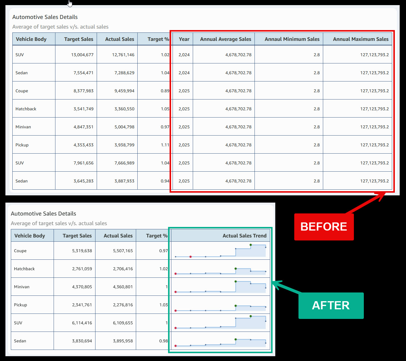
Consider a common scenario in automotive sales dashboards. The BEFORE table shows eight columns of data for each vehicle body type, including three that repeat the same static values across every row: Annual Average Sales, Annual Minimum Sales, and Annual Maximum Sales. These columns consume valuable dashboard real estate without adding decision-relevant context.
The first question a sales agent asks when reviewing a performance table is: How did each vehicle body type perform across the year? Previously, answering that required navigating to a separate line chart or requesting the author to build one.
The AFTER table solves both problems at once. By removing redundant columns and adding a single Annual Sales Trend sparkline column, the table goes from eight columns to five while delivering more insight, not less. Each vehicle body type now displays an inline trend with red dots marking low points and green dots marking peaks. A sales agent can instantly see whether Coupe is climbing, Pickup is declining, or SUV is holding steady, all without leaving the table.
The result: 37% less column space consumed, zero chart-switching required, and a complete performance picture visible in a single glance.

Custom sort in action
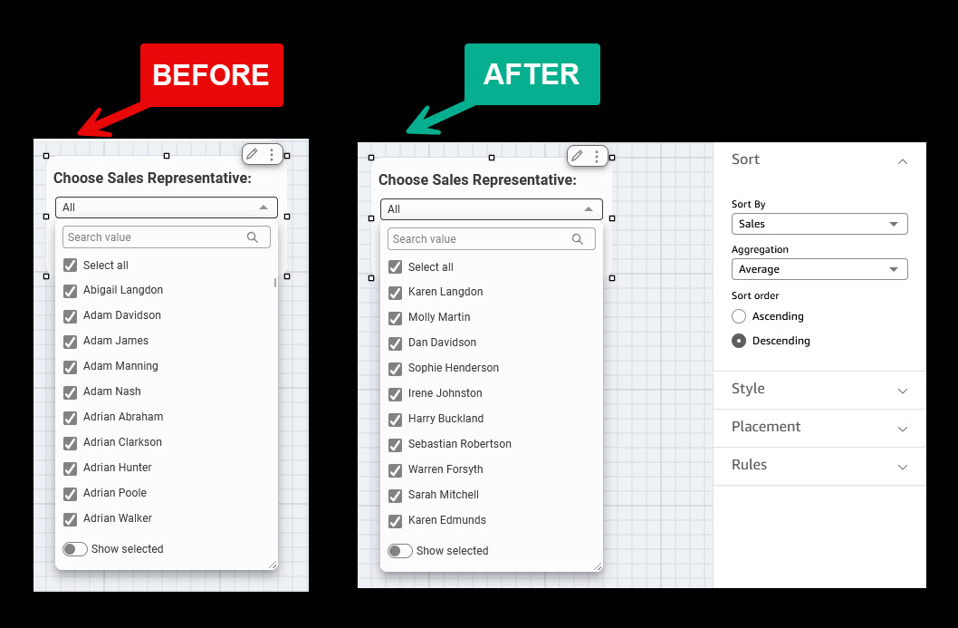
Consider a sales dashboard where a “Choose Sales Representative” drop-down filter helps managers select reps for performance review. The BEFORE view shows the default behavior: names listed in strict alphabetical order starting with Abigail Langdon, Adam Davidson, Adam James, Adam Manning, and continuing through every Adrian in the organization. A manager looking for their top performers must scroll through the entire list or search by name, already knowing who they are looking for.
The first question a sales manager asks when opening this drop-down is not “Whose name starts with A?” but rather “Who are my highest revenue generators?” Alphabetical sorting answers the wrong question entirely.
The AFTER view transforms this experience. Using the Sort by another field option, the author sets the Sort By field to Sales with Average aggregation in Descending order. Now the drop-down opens with the highest-performing reps at the top: Karen Langdon, Molly Martin, Dan Davidson, Sophie Henderson. The manager instantly sees top performers first without scrolling or guessing.
The result: A filter control that ranks by business impact, not the alphabet. Zero scrolling to find who matters, instant visibility into team performance, and a faster path to coaching decisions, all configured once by the author and inherited by every dashboard reader.
Financial reporting
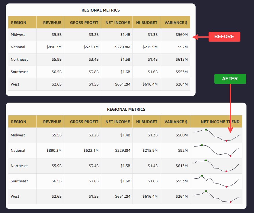
Sparklines in Quick Sight tables give finance teams a compact, in-context view of how numbers are trending over time, without requiring a separate chart. By embedding sparklines in a Variance or Budget Utilization column, you can surface spending patterns directly alongside your line items, making it easy to spot accelerating costs or underspend at a glance. Following is an example of how finance teams spot net income trends for all the regions.
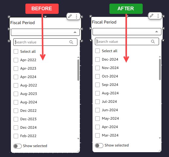
Financial calendars rarely follow alphabetical or chronological order. When your fiscal year starts in April or October, a default alphabetical sort on a period control leaves months like “January” buried mid-list instead of appearing where your finance team expects it. With custom sort on a filter control, you can reorder fiscal periods to match your organization’s reporting cycle. The following example shows the control is sorted descending based on fiscal period with the latest appearing on top.
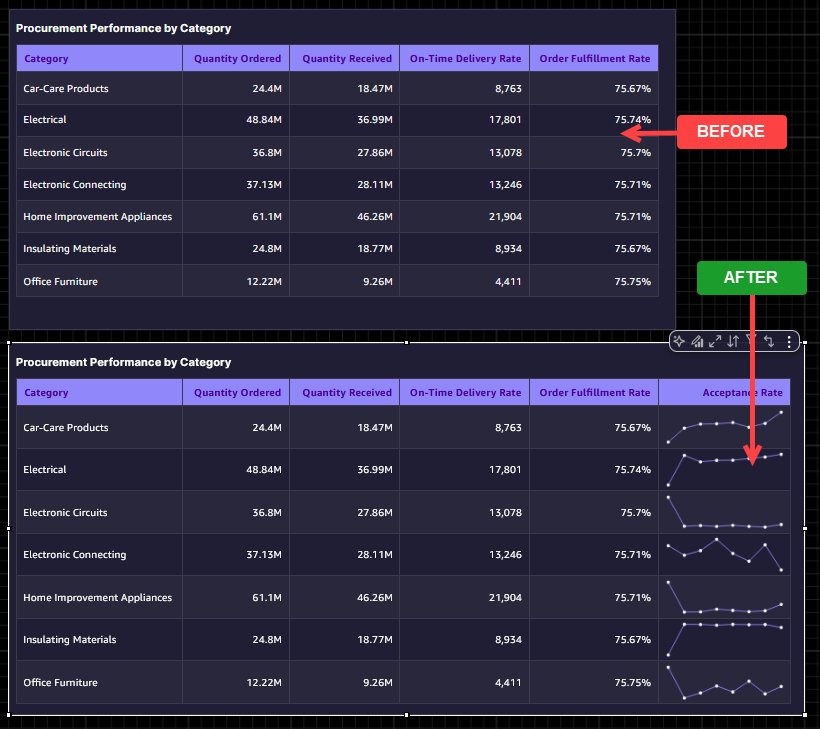
Operations and supply chain monitoring
Adding a sparkline for weekly acceptance rate directly into the table transforms a static scorecard into a dynamic performance monitor. Instead of seeing a single acceptance rate number that could mask recent quality issues, you get an inline trend that reveals whether a category’s acceptance rate is climbing, declining, or volatile week over week. A procurement manager reviewing the visual can instantly connect the dots: a category with a high order fulfillment rate, but a declining acceptance rate sparkline signals a supplier’s quality issue that raw numbers alone would not surface. This small visual addition turns the table from a reporting artifact into an early warning system, helping teams take corrective action before quality dips cascade into downstream delays.
Let us take a look at some of the factors you should consider when you implement sparklines and custom sort in your analysis.
Key considerations
Sparklines
- Supported only in table visuals, and not available in pivot tables, bar charts, KPIs, or other visual types.
- Maximum of 3 sparkline columns per table visual.
- Maximum of 52 data points per sparkline. If your data exceeds this limit, Quick displays the last 52 data points according to your X-axis sort order
- Requires at least one field in the Group by field well and one field in the Values field well.
- The X-axis field cannot be the same as any field in the Group by field well.
- A value column cannot be used by both a sparkline and a data bar simultaneously.
- Sparklines are included in PDF exports but are not included in CSV or Excel exports
- Filters applied to the table also filter sparkline data, so verify any active filters reflect the trend range you want readers to see
- Quick automatically removes sparklines when field changes make them invalid (for example, if all Group by fields are removed, or a sparkline’s value column is removed from the Values field well). A notification appears when this happens.
Custom sort for controls
- Available for Drop-down (single and multiselect) and List (single and multiselect) control styles only.
- Custom sort is not available for date type columns. To sort date values in a logical order, use the “sort by another field” option with a date-related field
- Sort configuration is defined at the author level during analysis design. Dashboard readers cannot modify the sort order.
- Dashboard controls inherit sort configuration from the analysis, and changes apply at publish time.
- For controls with values from both specific values and a source entity, values that cannot be sorted based on the current configuration are appended at the end of the list.
- For Sort by another field, only scalar (non-aggregated) calculated columns are available as sort fields.
Conclusion
Sparklines and custom sort for controls are two focused, high-impact additions to the Amazon Quick Sight authoring experience. Sparklines bring trend context directly into the table, the most-used visual in Quick Sight, so readers can identify patterns, seasonality, and trajectory without navigating to a separate chart. Custom sort for controls confirms that drop-down and list filter controls present values in the order your business thinks, whether that is by priority level, fiscal quarter, or revenue rank.
For authors, the result is fewer change requests and dashboards with a longer shelf life. For readers, the result is a richer, more intuitive experience that surfaces the right trends and the right priorities from the moment they open the dashboard.
Start using sparklines and custom sort in your Quick Sight analyses today to build tables that do not just display data but tell the story behind it.
Ready to put sparklines and custom sort to work? Here’s how to get started:
- Open your most-used table visual. Identify a table in one of your existing analyses that would benefit from inline trend context. Add a Sparkline column and see how quickly patterns emerge without adding a single chart. Visit Adding sparklines to tables in Quick for more details.
- Audit your filter controls. Review your dashboard drop-downs and list controls. Are they sorted alphabetically when they should be sorted by revenue, priority, or fiscal period? Apply custom sort to bring business logic to the forefront. Visit Sorting filter control values for more details.
- Combine both features for maximum impact. Pair a Sparkline-enabled table with a custom-sorted control to create a dashboard experience that tells the story your stakeholders need, in the order they expect.
- Share and iterate. Publish your updated dashboard and gather feedback from readers. Fewer follow-up questions and change requests are a strong signal that you’re on the right track.
- Explore the documentation. Visit the Amazon Quick User Guide for additional configuration options, including line color, interpolation styles, marker visibility, and sorting by related dataset columns.
Have questions or want to showcase what you’ve built? Connect with the Amazon Quick community and share your before-and-after results.
About the authors
Today, we’re excited to announce two new capabilities that make Quick Sight dashboards even more expressive and business-aligned: sparklines and custom sort for controls. In this post, we walk through both features, what they are, when to use them, and how to configure them, with real-world scenarios that bring them together in a practical, decision-ready dashboard. Read More